Posted on

Scroll pricing explained

We have recalculated our prices. For some scrolls, nothing changed, others have become 2-5 Euros more expensive. We thought this was probably a good moment to give you a little insight into our pricing process. Why do our scrolls cost what they cost?

First of all, it is important to us that our scrolls are being read.
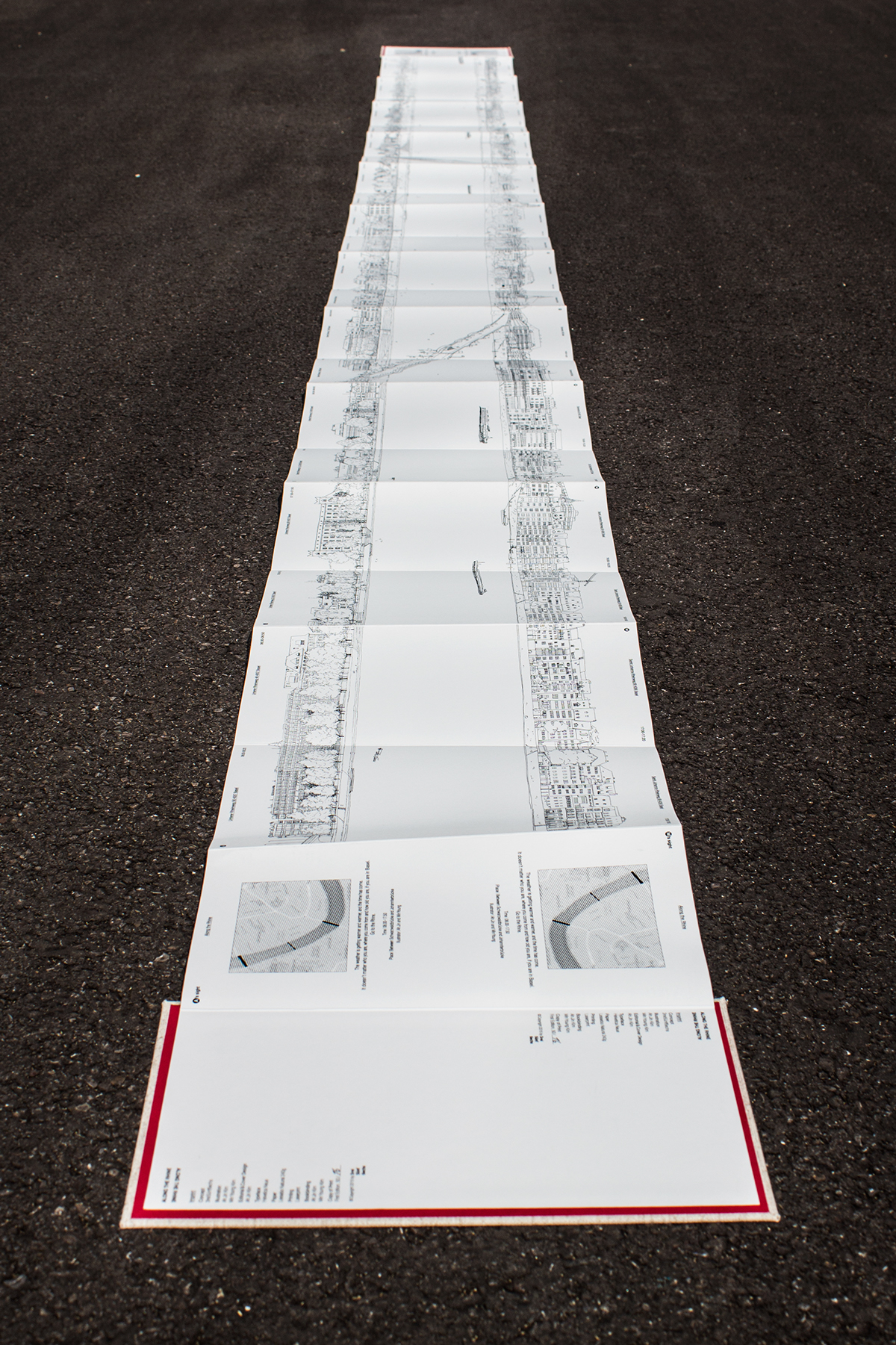
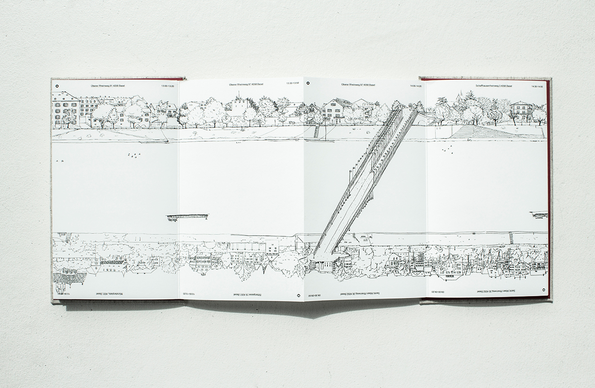
Of course, they are objects of art, but they are made to be scrolled through and experienced. This is only possible if we sell them at a price where readers still dare to do so. This is particularly true for our children’s books, which therefore continue to be our cheapest scrolls (apart from the notebook). At 27 Euros, we’re confident readers will still dare to just roll out the scroll once across the whole room. Not to mention that the paper is more robust than you might think.

Of course, we also want to be able to live from our work. To work in a small publishing house is a great luxury in itself, but bills need to be paid. And producing books by hand is quite time-consuming and expensive. We have exactly one (very large and very expensive) printer on which you can only print one scroll at a time. Then the covers need to be printed and cut, glued and folded. The scroll inserted, and if something goes wrong, it needs to get fixed. At least one hour of manual work goes into producing a single scroll


We want to be able to give our artists their fair share and it is important to us that they earn something from doing a project with us. Likewise, it is important to us to pay our bookbinders properly.

Overall, founding a small independent scroll publishing press has not made us rich – yet!

Incidentally, the price development on the book market is a huge topic overall. Fearing that fewer books will be purchased, book prices have hardly augmented for years, at a lower rate than the inflation. Even paperbacks, which are very cheap to produce, would actually need to cost more in order for publishers to have a reasonable margin. Think about how much a dinner or a visit to the movies cost and how much book you can get for that money. There’s got to something wrong …
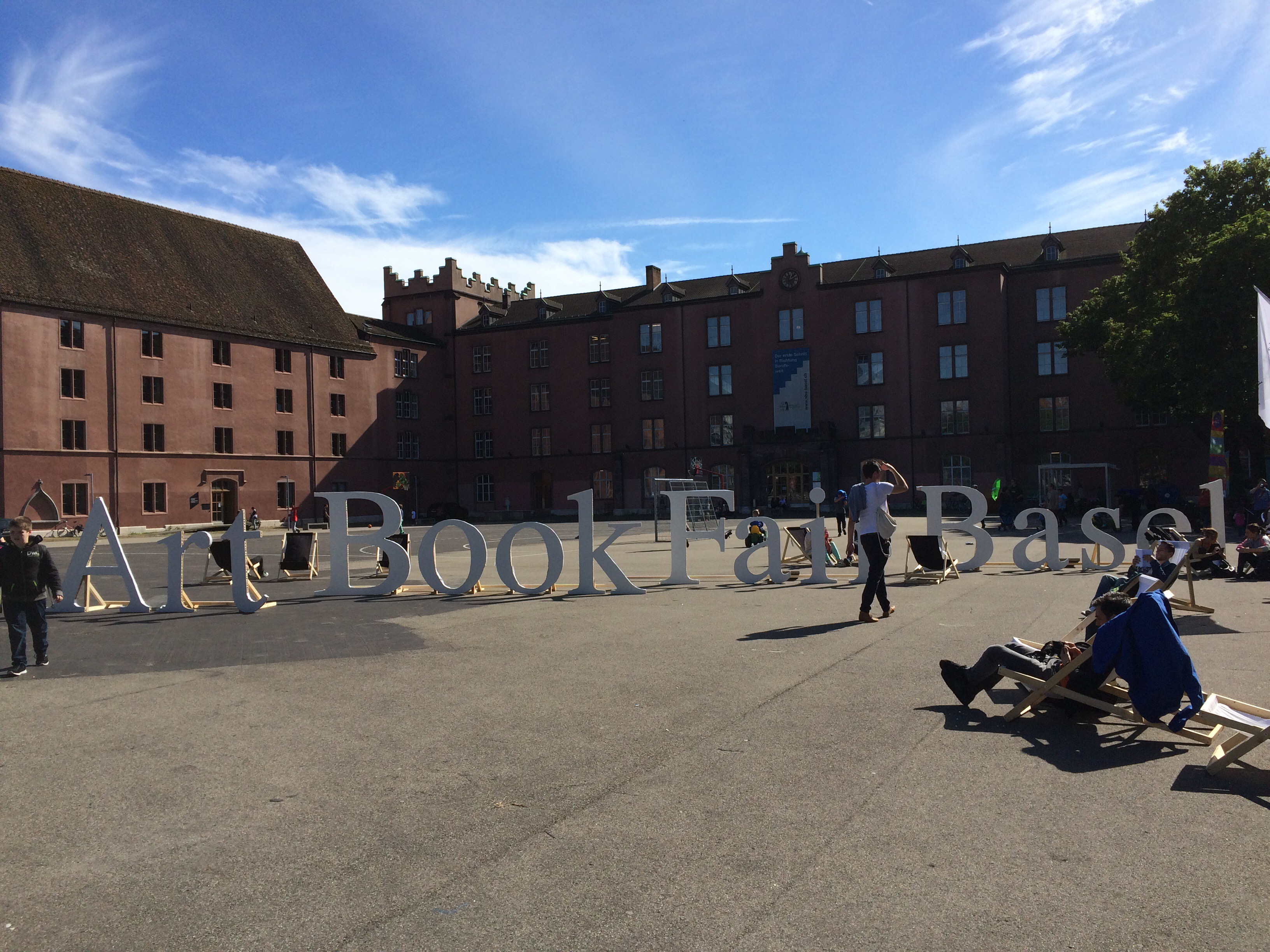
Anyways, this is just an aside. Because if you want to compare prices, it makes a lot more sense to compare our scrolls not to mass market paperbacks, but rather to art books, art prints or other handmade design objects.

Recently, our material costs have risen again, especially those for paper and ink. This is reflected in our new prices. We still find them fair. We hope you also see it that way and continue to value our work. Because one thing has certainly not changed: A lot of love goes into every single scroll we make.

Posted on

Round not Square in Sjøland

A trip to the Sjøland exhibition at the Edvard Munch House in Warnemünde

We spent last weekend in Warnemünde for the opening of an exhibition of Sjøland. The perfect occasion to virtually pack the entire publishing house into one car for a trip to the Baltic coast. Talk about combining business with pleasure! We took the opportunity to hang out on the beach one last time for this year, eat chips, fly our kite and we even went to watch some seals.

The Edvard-Munch-House

We went to Warnemünde with the Sjøland artists Herbert Eugen Wiegand and Heike Schmitz at an invitation of the Förderverein Edvard-Munch-Haus, an association dedicated to cultivating the memory of the Warnemünde period of Edvard Munch. The Norwegian painter spent 18 months there between 1907 and 1908, and today, the house he lived in at the time is used as a space for cultural encounters between Norway and Germany — what a perfect setting for Sjøland.

The building itself was very much one of the highlights of our visit. It is a beautiful historical fisherman’s house, one of a series of narrow, small houses built “Am Strom”, directly on the river Warnow. The house charms visitors with its beautiful winter garden, a courtyard with a pear tree and a cosy little library that is just perfect for a small – or large! – collection of scrolls.

The exhibition

And then there was the exhibition itself … The graphic from the Sjøland scrolls is made up of 96 single linocuts of the Norwegian coastal landscape stitched together (more about the scroll editions on our website). Herbert’s original prints look beautiful in the long, bright main room of the Munch house.
We also brought along some framed art prints from Sjøland that are now also available in our shop.


The opening of the exhibition was very well attended, which obviously made us very happy. There was a cordial introduction from Petra Schmidt Dreyblatt, artistic director of the Edvard Munch House, then Herbert talked a bit about Harøy and the changes in the region that inspired him to work on Sjøland. Heike added another, literary level to those insights, reading from some of her texts on which the story in the scrolls Sjø and Land is based. And last but not least, Antonia and Ioan gave quick introduction of Round not Square and explained why some ideas – such as Sjøland for example – should just not be squeezed into a normal book, when they could also appear on a scroll.

How to visit

The exhibition runs until November 25, 2018. The Edvard Munch House is always open on Saturdays from 11:00 to 17:00. Visits are also possible by prior arrangement. Go there to scroll through all the Sjøland editions — or come visit us in our shop in Berlin, of course!

Posted on

Privet, Provintsiya

A transmedial art show combining photographs, poetry, sound recordings and music, a full house and free vodka – the PROVINTSIYA event in Haus der Poesie just had it all. Here are some impressions of a really enjoyable evening – and a big thank you to everyone involved!

In their presentation Hendrik Jackson and Heinrich Völkel took us on a journey through the russian “provintsiya”. Afterwards, there was a cheerful get-together that was very fittingly accompanied by DJane Svetomusika and her Russian tunes. It was an all-round successful Russian evening. In fact, it wouldn’t surprise us if flights to Russia were booked that very night, that’s how much fun it was. If you don’t have enough time or money on your hands for that, don’t despair: At least you can always get the scroll!
Click here to find out more.

Posted on

Round not Square On The Rugs

Weil man bei Design aus dem Iran gerne an Teppiche denkt, haben wir uns für die Premiere unserer BEYOND CURTAINS Buchrolle mit Anna Wahdat von On the Rugs in Hamburg zusammen getan. Autorin Lena Späth reiste extra aus Barcelona an und setzte sich mit Antonia und FAZ-Redakteur Christian Meier zum Gespräch über ihr Projekt auf den Teppich.

Ein großes Dankeschön an Anna und ihren Vater Herrn Wahdat, die uns so herzlich begrüßten, dass uns trotz echt Hamburger Wetter gleich ganz warm ums Herz wurde.

Hier ein paar Impressionen von diesem rundum gelungenen Abend – inklusive Schnelldurchlauf durchs Buch!


Because we imagine carpets when we think about Persian design – and it’s true, though there’s so much more to it! – we paired up with Anna Wahdat from beautiful carpet lable On the Rugs in Hamburg for the launch of our latest scroll, BEYOND CURTAINS. Author Lena Späth came all the way from Barcelona and sat down on a stack of carpets with our own Antonia and FAZ-journalist Christian Meier for a diverting talk about her project and a Q&A session.

A huge and heartfelt Thank You to Anna and her father Mr. Wahdat who were so very welcoming we felt all warm and fuzzy in spite of real authentic Hamburg weather.

Here’s some impressions of this lovely evening – including a quick tour all through the scroll. Enjoy!


Posted on

Of Swine and Men

The German language has a plethora of sayings drawing comparisons with pigs. Crazy driving? You drive “like a singed pig”. You threw a party and nobody came? “Not a swine was there”. You go wild and have crazy fun? “You let the hog out”!

What else can this signify but a major influence of said animal on German culture? So it probably shouldn’t come as such a surprise that one of the first ever German comics had for its main character … exactly.

When Ludwig Emil Grimm set his mind to drawing a story about “the especially loving and peculiar pig from Ihringshausen”, not even the notorious brevity of an average pig’s lifespan – potentially quite a threat to storytelling – could deter him. Sure, realistically, it’s hard to avoid death by slaughter when narrating the life of a domestic pig  – but why let this get in the way of a good story?

So with a pointed pen and a lot of black humor, he went on to describe the life of a swine from the stable to the grave, or, well, local butcher … and beyond! Terminating only in what just might be the first ever autobiographical account by a pig in literature (post-mortem, too). The result? A story that’s as absurd as it is amusing, with beautifully executed, amazingly detailed drawings proving Grimm to have been not only a master of his craft but also a keen observer of his contemporaries’ foibles and quirks.

Once the hog is slaughtered and every single part from its ears to its hoofs turned into mountains of delicacies, us modern readers cannot help but make the comparison with the way we consume meat today. While of course even back in Grimm’s days not every swine was deserving of a comparable sendoff as the pig from Ihringshausen, which was famously especially peculiar, meat definitely was treated much more like a special luxury, and the animal providing it with considerable respect.

So it made sense that we celebrated the release of the book with a barbecue with our friends from Meine kleine Farm, the “online butchery” with a mission: Happier pigs, happier farmers, happier eaters, better food. If people realise what, no, who they eat, they’ll support farmers that take good care of their animals. Resulting in a quality of meat that will then again benefit the consumer. Less meat, more respect!

We’re pretty sure the Sau from Ihringshausen would approve.

Posted on

Paul Rietzl: A portrait

Paul was born in 1986. He lives and works as an illustrator and freelance artist in Augsburg, Germany. He thinks when drawing. And he thinks a lot. Paul is always looking for new possibilities of alternative storytelling, that is why he loves comics. And that is why we love him. For his notion and fascination of the sum of details, for his imagination with which he is making new worlds and for his talent to engage with the unknown and create something great out of it.

His portrait in 12 questions is only available in German at the moment.

Posted on

Comics und Buchrollen

Was ist ein Comic? Wo fängt das Medium an und wo hört es auf? Die einen erkennen bereits in steinzeitlichen Höhlenmalereien die ersten Belege der Comickunst, für andere ist Wilhelm Busch der Gründervater des Comics – und dazwischen liegt eine riesige Spanne mit unzähligen Möglichkeiten. Doch all diese Fragen brauchen uns an dieser Stelle nicht weiter zu beschäftigen, denn was sich mit einiger Sicherheit festhalten lässt, ist, dass der moderne Comic, wie wir ihn heute kennen, seinen Ursprung in amerikanischen Tageszeitungen hatte.

Da Comics in den Tageszeitungen anfangs immer eine unterhaltende und vor allem komödiantische Komponente besaßen, gerieten sie schnell in die Ecke für „Schund” und „Kinderkram“. Natürlich sind sie viel mehr als das – trotzdem blieb dem Medium in Deutschland die Anerkennung, gerade im Vergleich zu Frankreich, Japan und den USA, verwehrt. Es gibt Comics, die sich mit wichtigen kulturellen und gesellschaftlichen Fragestellungen auseinandersetzen, den Lesern etwas beibringen, neue Perspektiven aufzeigen, Wissen und Werte vermitteln, Fragen aufwerfen oder auch einfach nur gute Freunde gegen die Langeweile werden. Egal ob heldenhaft, abenteuerlich, lustig, politisch, lehrreich, emotional, gruselig, dokumentarisch oder philosophisch; jedes Thema hat seine Daseinsberechtigung und erst diese Vielfalt verleiht dem Medium seine Tiefe.

Obwohl sich der Comic bereits Ende des 20. Jahrhunderts als eigenständige Medienform etabliert hatte, gelang es ihm nicht vollends, das Label der Schundliteratur abzustreifen. Unterstützung im Streben nach Anerkennung erhielt der Comic unerwartet aus einer ganz anderen Richtung: dem Film. Denn das Aufkommen der zahlreichen Comicverfilmungen lieferte dem Medium eine neue Aufmerksamkeit. Ein entscheidendes Puzzleteil dieses Umdenkens war sicherlich Christopher Nolans „The Dark Knight“ (2008), der auf der Liste der weltweit erfolgreichsten Filme aller Zeiten Platz 26 belegt (Stand: 22. September ’16).

Dass auch technische Entwicklungen die Genese des Comics beeinflussten, thematisierte Scott McCloud, selber Comic-Künstler und -Theoretiker, um die Jahrtausendwende mit seinem Werk „Comics neu erfinden“. In der zunehmenden Verbreitung des Heimcomputers und mit dem Aufkommen des Internets sah er das Potenzial neuer Gestaltungsfreiheit und etablierte den Begriff der „unendlichen Leinwand“; womit es ihm vor allem um digitale Comics ging. Durch den Heimcomputer war damals eine neue Art des Lesens angebrochen, die heute selbstverständlich ist, denn die Nutzer der Websites mussten nun „scrollen“, um sie zu lesen. Und wenn es möglich war, Websites auf diese Art zu gestalten, wieso dann nicht auch Comics? Ein Gedanke, der Scott McCloud zur „unendlichen Leinwand“ inspirierte. Die Vielfalt des Comics setzte sich also nicht mehr nur inhaltlich fort, sondern fand auch in der Auseinandersetzung mit den Grenzen des Formats statt.

Ein Künstler, der das Format der „unendlichen Leinwand“ besonders beherzigt hat, ist Daniel Lieske. Mit seiner digitalen Graphic Novel „Wormworld Saga“ (die er kostenlos zugänglich gemacht hat) setzte er praktisch dort an, wo Scott McClouds Theorie hindeutete – ein Comic, der das gängige Format aufbricht und durch seine unendlich anmutende Gestaltung im Lesefluss nicht unterbrochen wird.

Für den Comic ist also die Stunde der Freiheit angebrochen. Das Medium entwächst nicht nur dem ohnehin schon immer falsch gesetzten Label „Kinderkram“, es drängt förmlich in die Richtung der neuen Ideen und Ansprüche, der Freiheit im Denken, der neuen Plots und unverbrauchten Formate. Das gefällt uns natürlich. Und was bietet sich da mehr an, als die neuen digitalen Freiheiten auch physisch umzusetzen? Also arbeiten wir schon seit einiger Zeit an unserem ersten Comic, natürlich nicht alleine, sondern in Persona von Paul Rietzl. Im Herbst erscheint dann sein Werk „Shipwreck“ bei Round not Square als erster Comic auf Buchrolle; mehr dazu gibt es bald. Eine gewisse Aufregung lässt sich an dieser Stelle nicht leugnen und wir geben zu, dass wir mit unseren Buchrollen vielleicht noch ein Stück weit von unendlich entfernt sind – aber mindestens genauso fern sind wir dem gewöhnlichen DIN A4-Format.

Unter den folgenden Links könnt ihr Paul Rietzl folgen und euch jetzt schon Eindrücke zu seinen Arbeiten verschaffen:
Pauls Website | Paul bei Facebook | bei Twitter | bei Tumblr | und Behance

Posted on

I Never Read

Me neither.

I know that art can be worth a thousand words, that one can feel the hours of work that went into selecting the right paper for a book and that, besides the knowledge contained, a book’s worth is also defined by the quality of work that went into binding and realizing it.

The I Never Read Art Book Fair Basel was quite the right place for discovering this kind of special books. There were some amazing art projects on display there and I’d love to share some which particularly caught my eye with you:

Black print on black paper: as crazy as it sounds
There is a reason why certain culture differentiate between various shades of black or various tones of white. Because black is not black. And the project below really caught my eye, because it pushes these boundaries and introduces contrast where you wouldn’t expect it with the right choice of paper and ink. It’s just gorgeous!

IMG_0334.JPG

3000m: what happens when you take a pencil and draw lines until the pencil is consumed
Martin Schwab – an Artist book binder based in Basel – took a pencil and started drawing lines on paper… 1.080 pages later, the pencil was consumed. Binding these pages with a stunning red an gold cover makes for a piece of art which could be the most exclusive notebook ever if you’d want to put it to practical use or juste a unique collectible.

Hundert-102

Along the Rhine: oh wait, that should have been printed on a scroll!
The Basel based independent publishing group 3rei5uenf6echs brought this leporello to Basel and although I stood in ave and admiration in front of the drawing and the quality of the book realized, I couldn’t help but think that it would have been amazing as a scroll as well. Definitely and inspiration for us!

6ab83225745853.55e3baacd089ca14ac725745853.55e3baacd42d2

After all that looking and touching, I felt like I could take a rest in one of the lounge chairs scattered around in the courtyard of Kaserne Basel and finish up Kerouac’s “on the road – the original scroll” (yes, right, he wrote that one on a scroll! Imagine…) while snacking on Ricola sweets gently provided in incredible quantities by I Never Read’s main sponsor.

I Never Read. Unless I do.

IMG_0331

Posted on

Summer in the City

Summer is here! The sun is shining and the sky is blue, it’s getting warmer and warmer, bees are humming – you get the picture – and everybody who is still inside starts contemplating how to change that and leave the house for a bit of summer in the city.

This is what we want to do as well.

Why we do fairs, one might ask, as we are talking constantly about our new shop (and seen from that perspective I don’t know why I would ever leave my beautiful desk). But these fairs – focused on books, art or design – have considerable advantages, of course. We can get our books some fresh air, meet lots of interested people and enjoy the special atmosphere. The crowd is open, at least, if not in search of the unusual, the unseen and unheard of. Especially the small, relatively new markets are so much more casual, urban and fresh than many of the well-established huge events. And in summer it is just great fun to be around and a part of all this. Between food stalls, music and ice cream you can find innovative ideas, lots of inspiration, unique things … and our scrolls!

After having had a marvelous time at the supernice and not less successful UlmUnusual design fair in Germany’s South in March, our next stop is the most local of all design markets (at least for us): Weddingmarkt at Nordufer in our beloved neighborhood: Berlin’s one and only Wedding. On June, 5th and July, 3rd we will contribute to Wedding’s local culture at Nordufer by selling our precious books to fellow Weddingers, berliners and interested others.

And what else is coming up?

We are preparing for the „I never Read“ in Basel at the moment, which is taking place the 15th to 18th of June. And then, the 18th of June is the summer street party on Wörther Straße in Prenzlauer Berg’s Kollwitzkiez. We will be selling our scrolls at one of Berlin’s nicest book shops that day, all day long: the Georg Büchner Kunstbuchladen.

So, maybe, we’ll meet you there with a glass of white wine in our hands, strawberries in our mouths or just summer in our hearts.

Posted on

In retrospect: “Eurylochus” – Vernissage

We celebrated the opening of our exhibition of Simon Becker’s photographs from our art book „Eurylochus“. This was special to us for various reasons. One obviously being that we are able to show one of our artist’s work to a broader audience. Another one is that with this step we set our foot in the field of high quality art print – which you can easily get excited about!

Eurylochus Vernissage

Luckily finding the right location for the exhibition wasn’t a challenge at all. When we got to know this beautiful french wine bar „oui, madame“ in Mitte, we fell in love right away. With lots of black and wooden elements the atmosphere of the bar is very cosy and stylish at the same time. Simon Becker’s mysterious and equally inviting photographs were the obvious choice for this place – it was a perfect match!

We decided to pick up the black and wooden theme and create frames from natural wood to contrast and also complement Simon’s black and white pictures. We found the perfect material in old attic doors and upcycled them into these handmade frames.

Eurylochus Vernissage
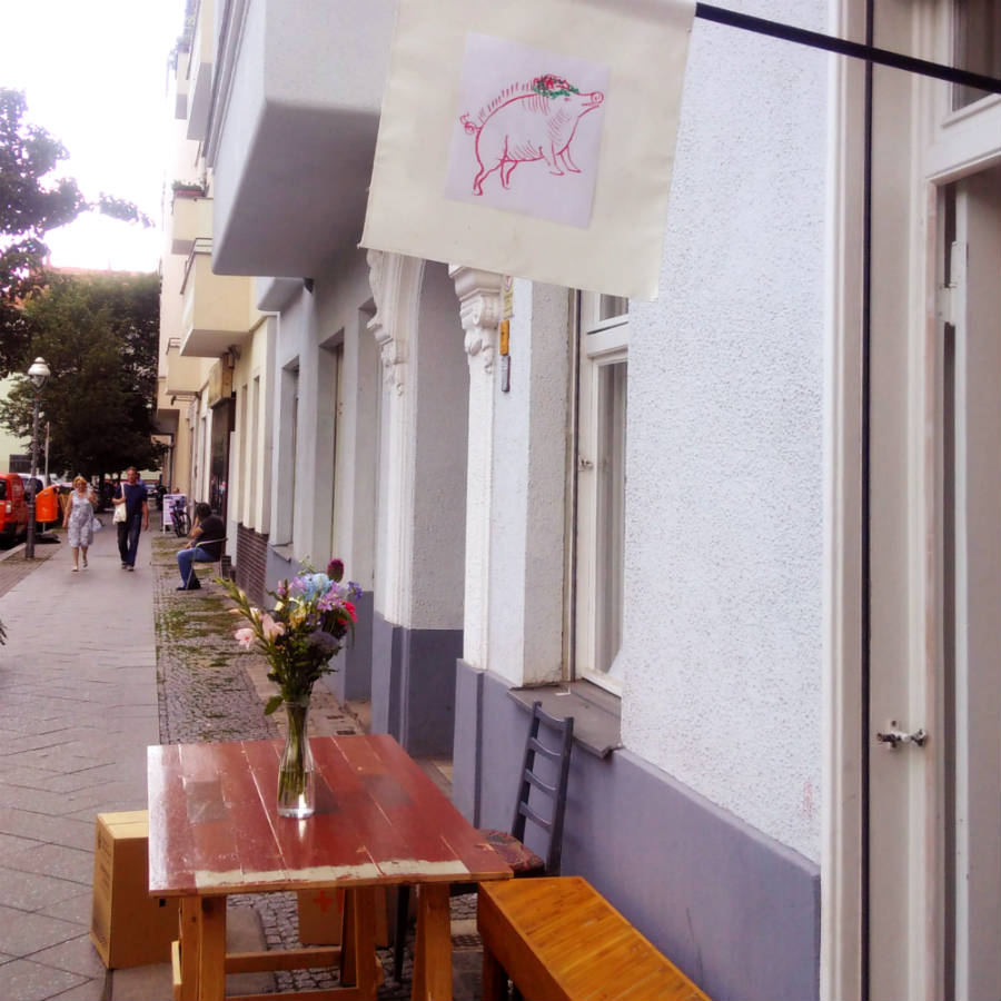
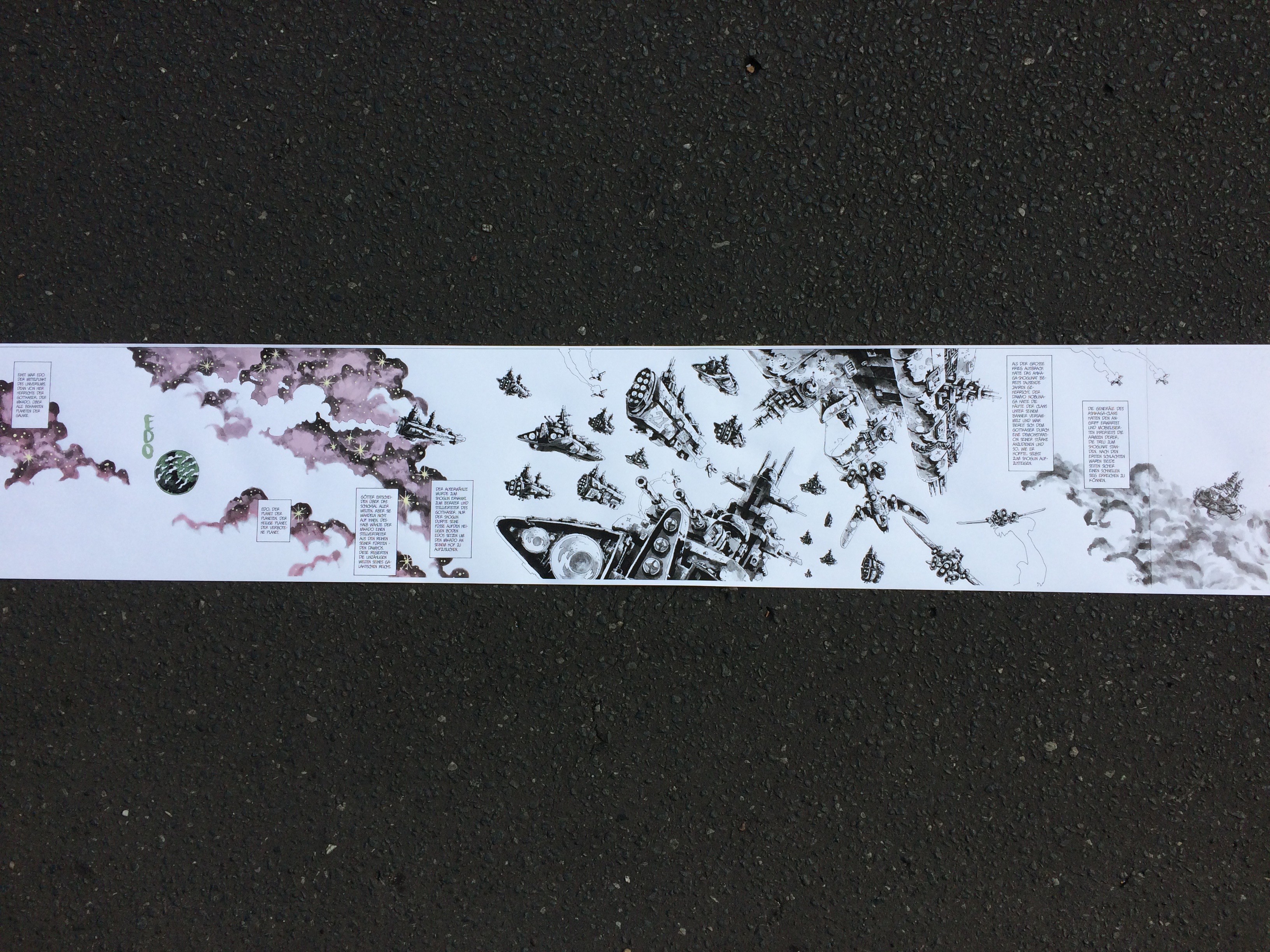
Obviously none of the photographs we showcase at oui, madame is round and all of them are very square, but we nonetheless stayed true to our concept, which stands for an extraordinary format. We enable our artists to give every picture its very own, individual dimensions at the highest quality – in our books as well as in art prints. Thats why the photographs at our vernissage are everything but standard format. The largest exhibition piece is over two meters long, the smallest only 40 centimeters.

In the end we are beyond happy with the outcome of this evening. We had a fun time at the vernissage, enjoyed fine wine and beautiful live music by „La petit mort“. We can only recommend everyone who is into photography (and french wine) to pay oui, madame a visit (Almstadtstraße 43, 10119 Berlin). There you can still keep Simon Becker’s framed photographs company, admire them or even – if you feel the urge – decide to purchase a piece of art, printed and handmade in Berlin.